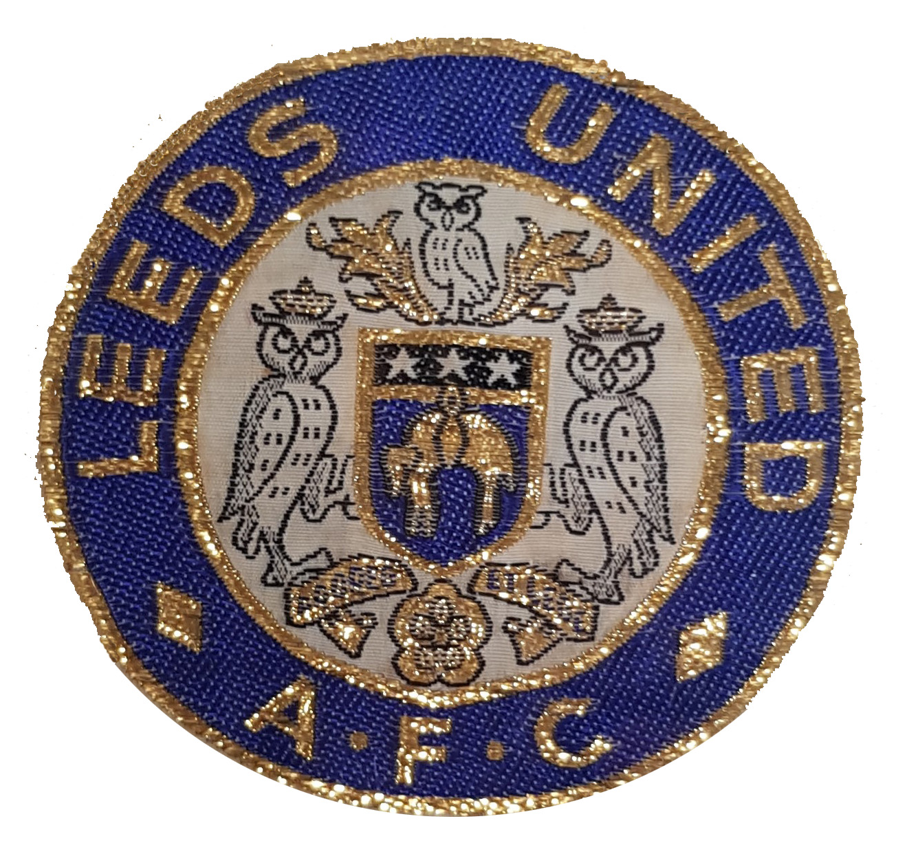
When Leeds United were formed in 1919, the team wore a kit of blue and white stripes. In 1934, the club adopted blue and gold as their colours, similar to those of former club Leeds City, with whom they shared the nickname of 'The Peacocks.' Like that of their predecessor club, the new crest was based on the coat of arms of the City of Leeds and was worn until 1961.
During the successful Revie era, there were lots of changes to the United strip. In 1961, Revie changed the club’s kit to an all-white design, in the style of Real Madrid. He added coloured number tags attached to the players' socks and, during the 1973-74 season, players could choose shirts with various collar styles and with either long or short sleeves. Revie also signed a contract with Admiral, a brand new sportswear firm, to produce branded replica kits for fans to buy.
During the 1980s the badge went through a number of iterations, including using the image of a peacock, in homage to the club’s earlier nickname. In 1984 a fan competition was launched to redesign the badge, resulting in a circular design featuring a football in the centre of a white rose of Yorkshire.
The current design was introduced in 1998 and incorporates the Yorkshire rose with ‘LUFC’ written vertically underneath in the team’s distinctive font on a blue and yellow background.

